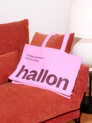
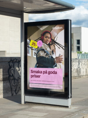
We created a playful concept using fruit labels in the redesign, drawing on their universal recognizability and playful, affordable connotations. This approach not only aligned with Hallon's straightforward ethos but also infused the brand with a fresh, playful and vibrant style represented in all assets from the colour scheme to the illustrations.
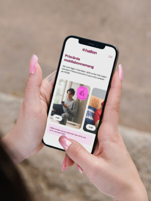
By using functional UX principles and refreshed UI design we emphasized Hallon's commitment to offering transparent and reasonable pricing, without sacrificing quality or service.