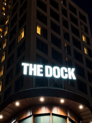
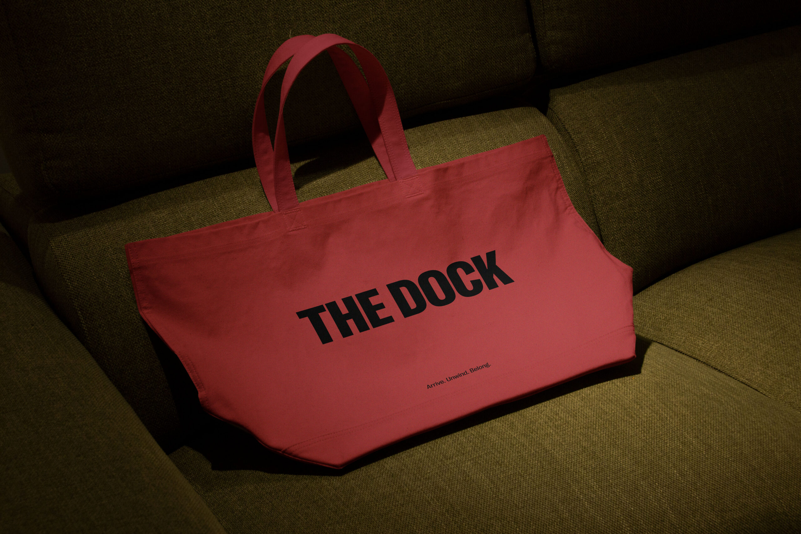
Set right on the waterfront, The Dock is a destination hotel with an international feel. Bringing together 183 rooms, a panoramic skybar, restaurants, meeting spaces, a cinema and a 2,000 m² spa, it was designed for weekend getaways, great dinners, memorable meetings and everything in between. Arrive. Unwind. Belong.
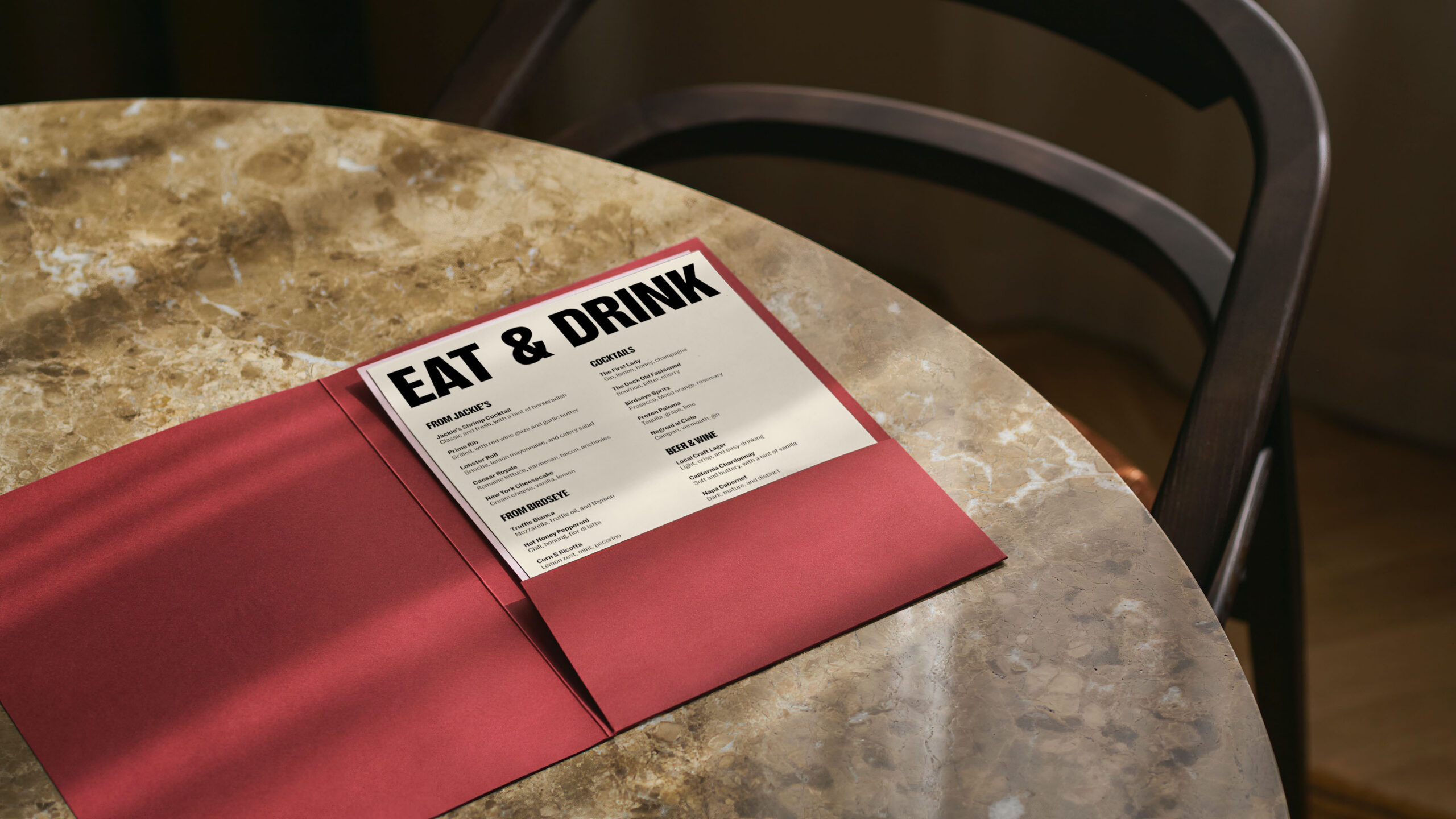
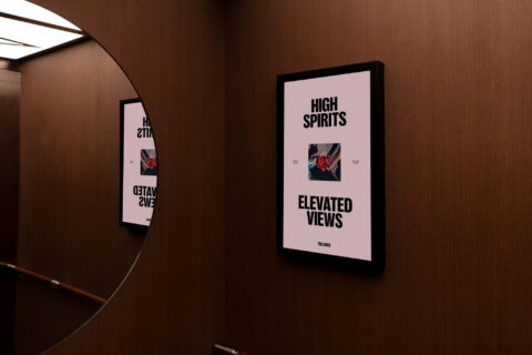
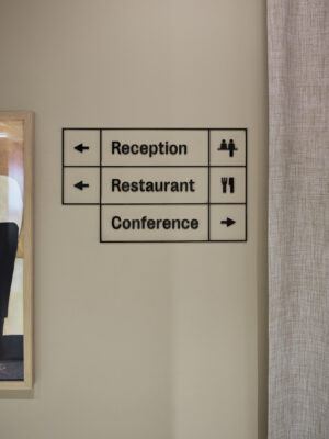
The typography draws inspiration from Södertälje's industrial heritage. Condensed, bold and confident, it creates a distinctive rhythm across the identity while giving the brand an unmistakably urban character. Paired with a restrained layout system, it balances clarity with warmth across everything from signage and menus to digital touchpoints.
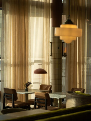
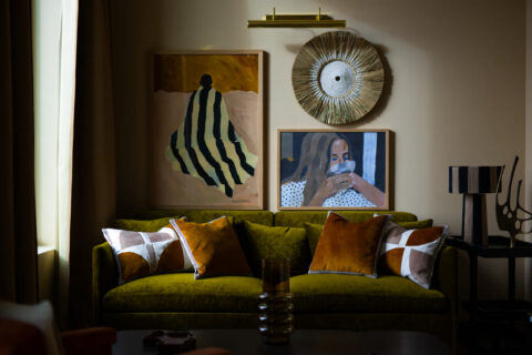
Built from the inside out
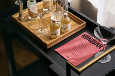
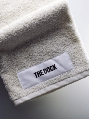
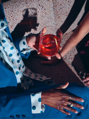
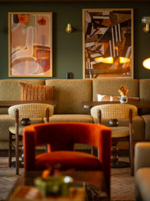
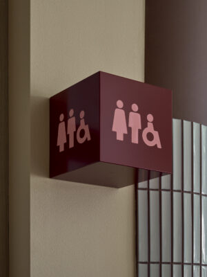
The identity grows directly from the hotel's interiors. Deep burgundy, cream, dusty pink and black mirror the carefully curated material palette, while warm photography and generous colour saturation reinforce the welcoming atmosphere. Rather than decorating the hotel, the identity feels like a natural extension of the space itself.
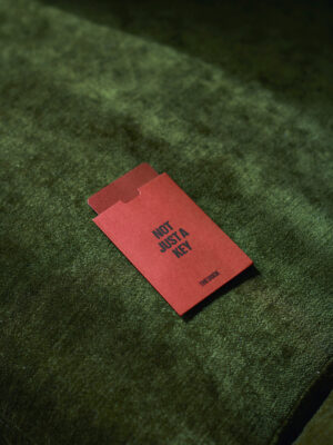
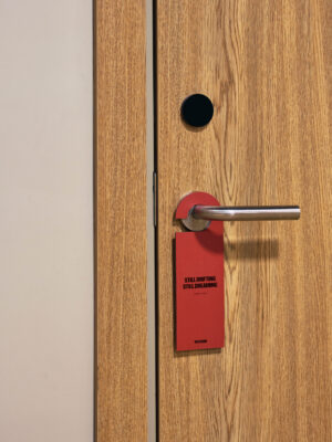
Spoken like a true host
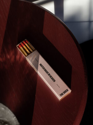
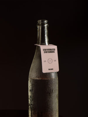
The Dock speaks with confidence, curiosity and charm. Headlines are short and memorable, while everyday copy stays clear, conversational and human. Whether welcoming guests, introducing a cocktail or guiding someone through the hotel, every word is designed to feel as considered as the experience itself.