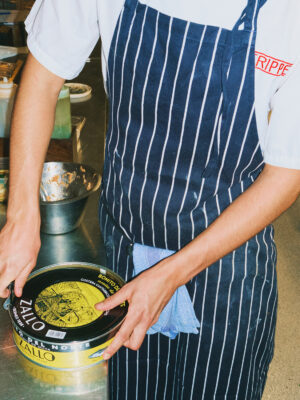
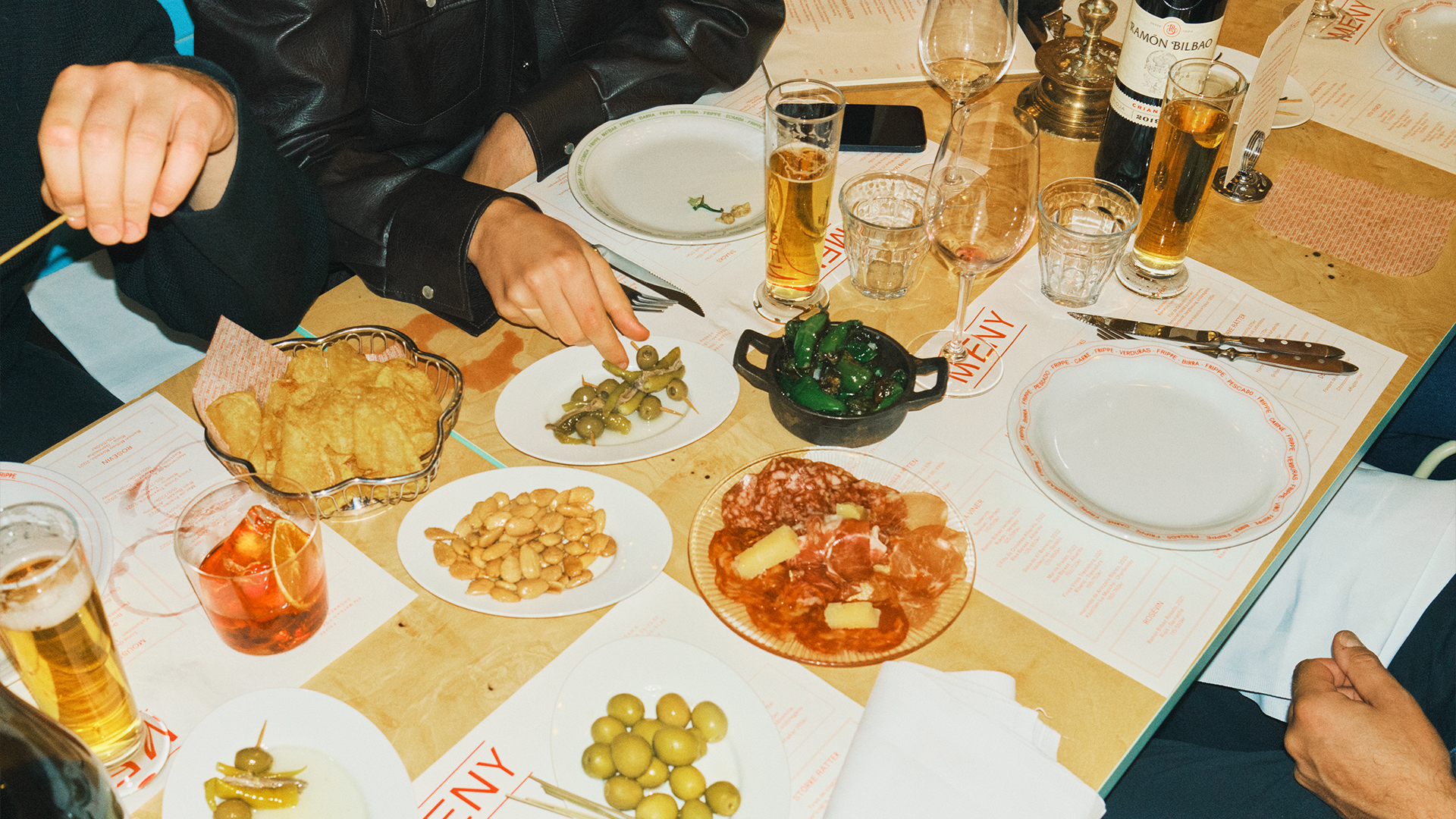
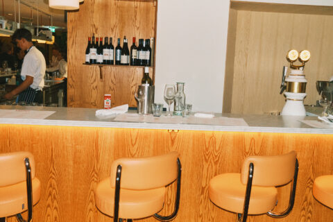
Frippe, a Stockholm staple named after the late theatre titan Gustaf "Frippe" Fredrikson, had over the years lost its course and needed new life. The remedy? A restaurant that is a bar, literally: an unpretentious, unapologetically mediterranean and somewhat rowdy food bar — with a capital B. Stockholm's longest marble counter for food, drinks and conversation alike.
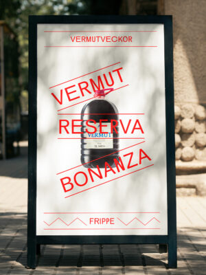
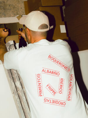
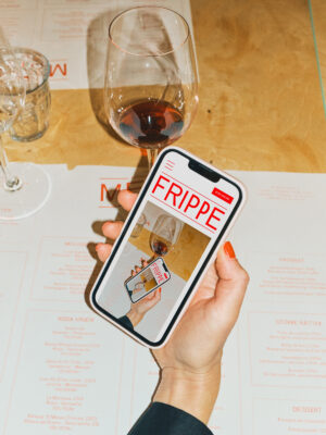
The "rowdy food bar" served as a foundation for how we designed the brand identity and visuals. The execution is simple but strong: two lines encapsulating the most important information and effectively creating a part of the “bar”. From logotype to headlines to images and illustrations, the possibilities are endless.
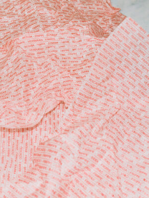
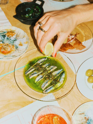


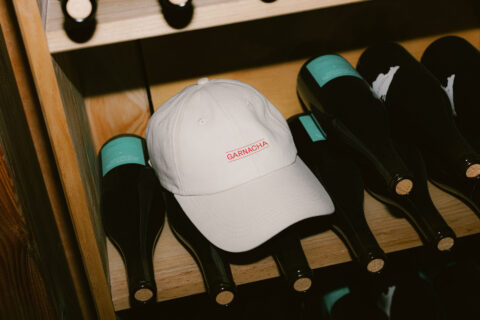
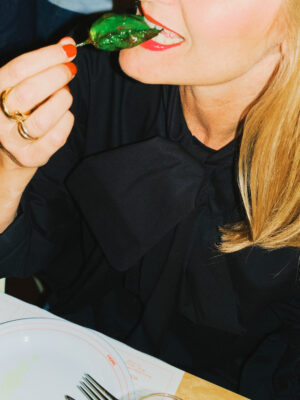
To further reinforce the concept, we used an irregular and flexible typeface where letters change widths and proportions as you type. What ties it all together is an ultra simplified color palette, mainly consisting of one vibrant red, a splash of green, white and black.