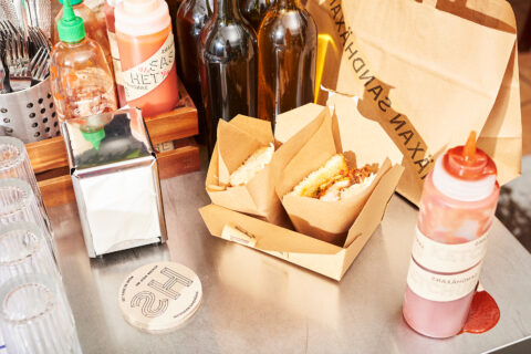
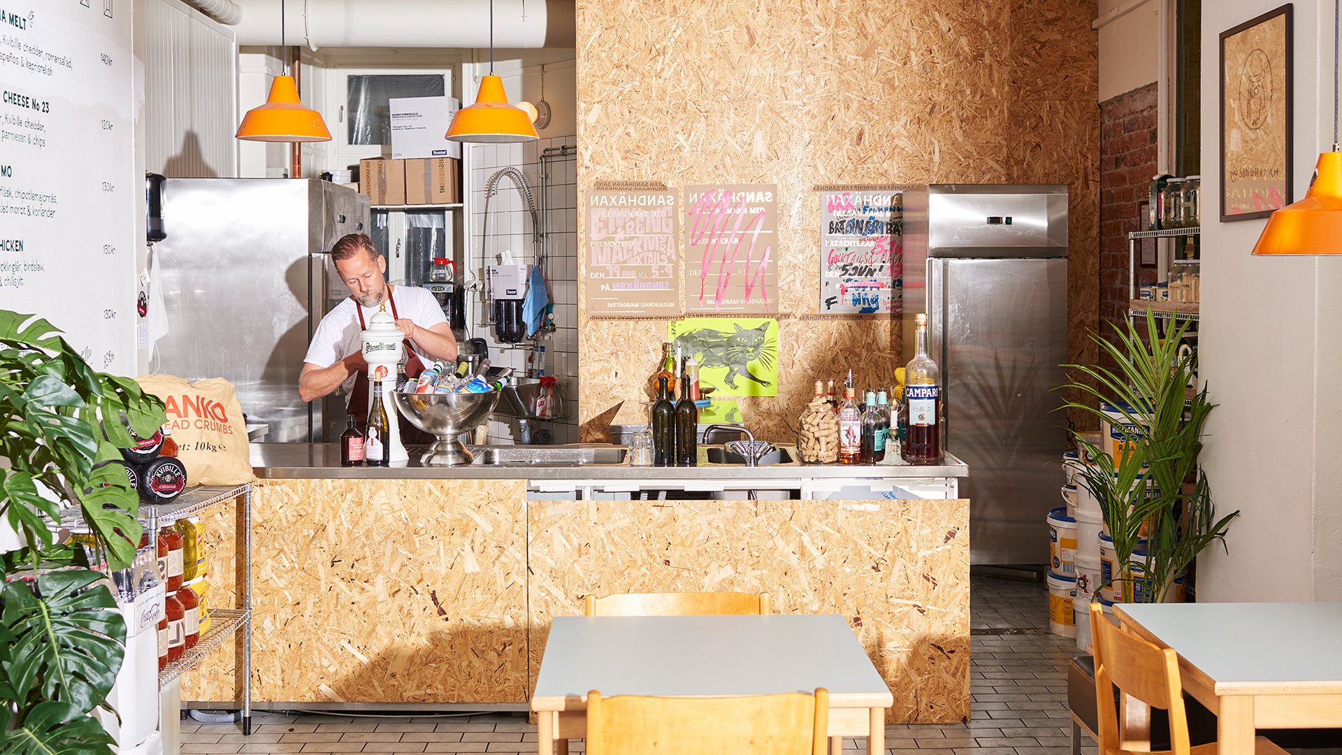
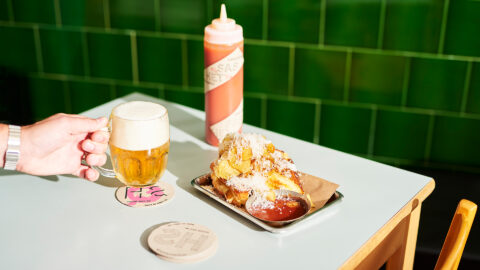
Sandhäxan is a restaurant and sandwich shop in central Stockholm, established 2019. A new brand identity for a brand new restaurant. The identity needed to be powerful, yet easy to use, cost efficient and adaptable to every situation. As a restaurant the food is center of attention, and the design frames it.
“The Witch” became our common concept, since “häxan” means the witch in Swedish. One never knows what the witch will come up with, but one is sure of two things, she is rich in gold but messy in nature. Things have been shaken, gold has been stolen and magic has been made.
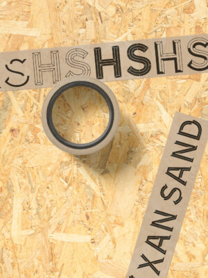
We created a design framework based on a custom made typeface, raw materials and a dash of gold. The typeface called POM contains of 7 weights with 5 different cuts making it possible to surprise, disrupt and find new expressions.
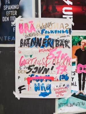
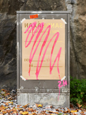
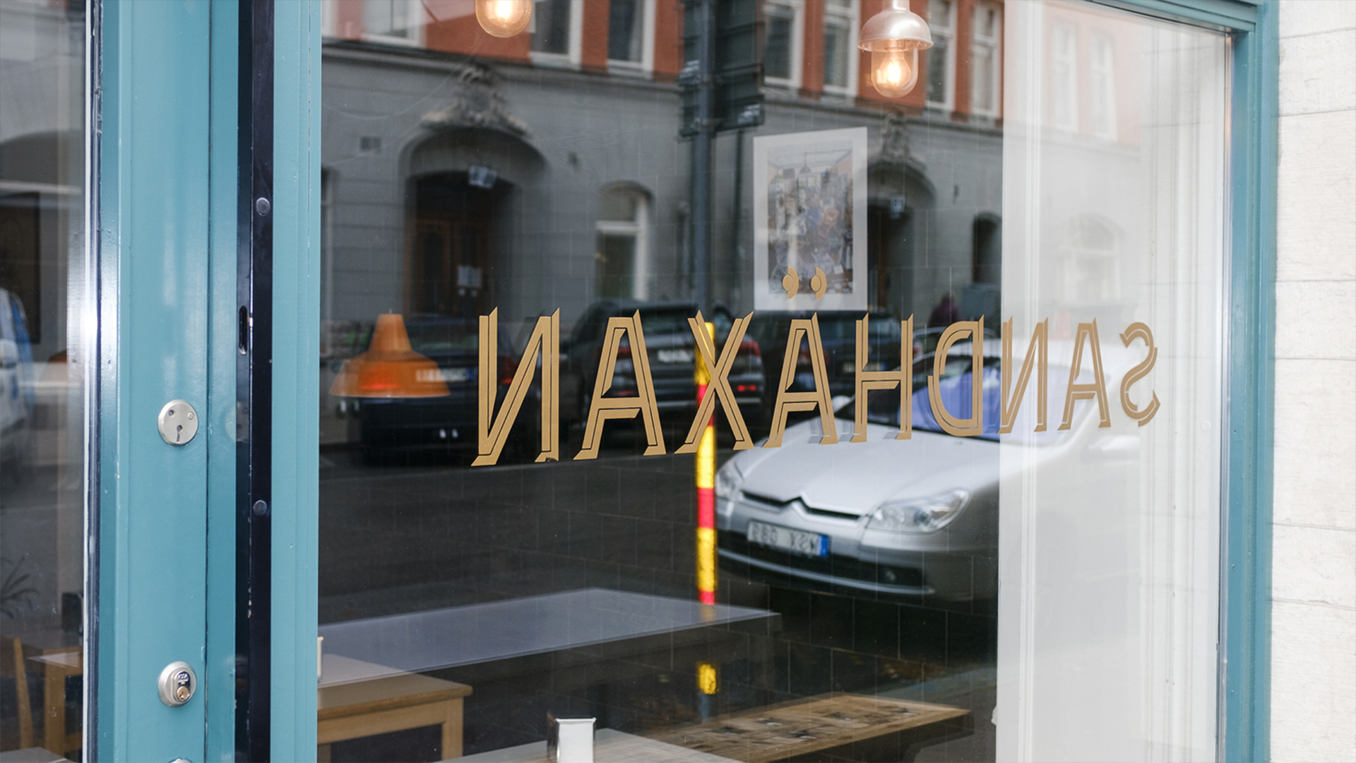
Gold together with coloured markers and the application system of raw tape, bags and poster templates creates contrasts and embodies the thought of not knowing what can happen when the Witch is present. Sometimes when the design is too thought through the Witch tricks us, that was what happened with the mirrored window sign that can only be read correctly when your already lured inside. But that is fine with us!