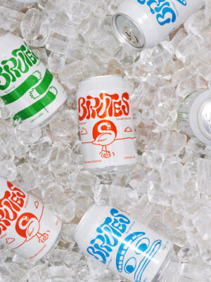
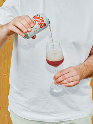
Brutes are a different cider company. Different in that they use 100% fruit where most other ciders use about 15%. Different in how they taste and smell. Different in what apples they use. Different in that it’s not French, Basque or British cider. It’s nordic. It’s fresh. It’s delicious. It's unexpected. But maybe most of all, it’s simply fun. This set the foundation of the brand identity.
The logo is based on the idea of letting the ciders go their own way and not intervene too much in the process. Brutes believe that is key to achieving interesting flavours and character through the process of wild fermentation. Simply put, it's just fruit, pressed and left to do its thing. This makes sure each batch differs a little from the previous one, creating a living product line.
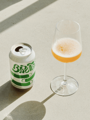
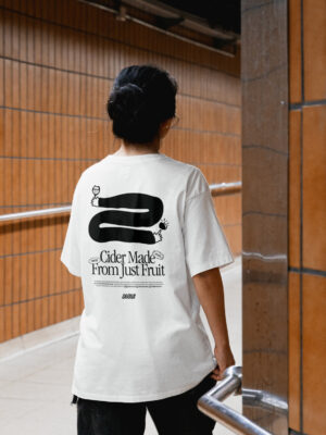
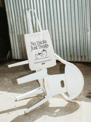
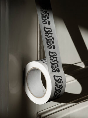
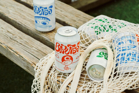
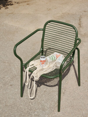
The illustrations are hand made and rugged to reflect the way Brutes makes cider; with craft, realness and humor. They add a layer of playfulness and extends the Brutes world further by introducing characters, fruits and fun that play on the product names; Group Hug, Northern Tropics and A Class Act, to name a few. They are used both on packaging, merch and communication — colorised for packaging, monochrome black for merch and communication.