Reactions on the Swedish global Brand Identity
When we launched Sweden’s new global identity 2013, we were eager to know how it would be received, especially abroad, among the target audience, and with our peers in design circles. So we ran some metrics on reach and sentiment. How did we do?
News of the identity made it into the social news feeds of at least 2.6 million people, via at least 31 web publications, the overwhelming majority of which were positive, both in their coverage and in the comments they generated. For those interested in the raw numbers, here’s the data as a spreadsheet.
Inside Sweden, mainstream coverage was negative. Sweden’s largest tabloid Aftonbladet led with the cost of the project:
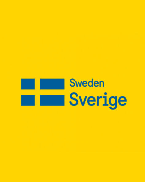
Sweden has a new global brand identity – for SEK 480,000. For that money it got a logo with the Swedish flag and the country’s name in two languages.
“Not very exciting,” says brand expert Niklas Turner Olovzon.”
Dagens Industri, Sweden’s financial paper, adopted the same tone in its uncritical rewrite of Aftonbladet’s story, eliciting comments like this:
Please tell me this is a joke. Purely in terms of style, it reminds me of those blue shirts with yellow crowns from 1973. Square and so damn yellow.
Swedish gadget site Feber, in turn, rewrote Dagens Industri’s story, but its tech-savvy readers did some fact-checking:
Feber, are you trolling us? Are you consciously trying to make people angry? Perhaps you could have written a little more honest article, where you mention that the work contains much more than just a logo.
I don’t think Feber describes this project accurately. It is much more than a “logo”. People don’t seem to understand that behind this there is a whole identity and branding. I myself think that this was really good workmanship and that Söderhavet should get a lot of cred for this well-executed project. As for all of you who think you could do this yourself, I do not know whether to laugh or cry.
Outside Sweden, those sites that editorialized the new identity gave it uniformly positive reviews. Some of the most effusive endorsements came from Latin countries, both in their coverage and in the comments.
From Italy’s Kollektivo Kuore:
Grand and clean Nordic design; we have much to learn!
Bravo. Essential and direct.
Fresh, clean, bright and modern. Work at this level conveys reassurance.
From Spain’s Brandemia:
They opted for an honest and functional solution. The most brilliant aspect of this new brand is its embrace of the traditional toponym ‘Sverige’.
I really love the simplicity of this brand. The use of naming in Swedish, just great. Back to simple.
Very good. One of the best country brands!
From Brazil’s Choco la Design:
Remember that Sweden is part of Scandinavia, a region known, among other factors, for its design — its minimalism, functionality, practicality and simplicity. The Sweden Sans typeface as a whole reflects this very well.
The British, true pioneers in nation branding work, also scrutinized Sweden’s new brand identity. UK design bible Creative Review wrote:
Söderhavet’s work for Sweden is striking and versatile. The new sweden.se and work.sweden.se sites look great and are easy to navigate, and the custom typeface works well both online and off.
From the comments:
Me as a danish webmaster based in the black forest, southern Germany, must say: Excellent design. You swedish people have great taste. Well done!
Bold, bright, confident and versatile. great combination to represent an entire nation.
In the US, the branding authority Brand New wrote:
The strength of this project lies in its role as a unifier for five separate organizations, each with its own logo, tone of voice, and audience from tourists to politicians to business people — they will still each do their own thing but with the flag and the word Sverige as the endorsing elements.
From the comments:
It’s simple, it’s versatile and it’s beautifully designed.
As Swedish as it could ever possibly be. I’m a sucker for those slightly odd sans typefaces, mimicking a monospaced font.
But perhaps our favorite endorsement came from the world’s largest community of design professionals, Adobe’s Behance, whose editors chose Sweden’s new brand identity as a featured project on their home page. The resulting exposure led to some great feedback:
It’s refreshing and surprising to see a progressive, forward-thinking design system adopted by a government. Such creativity is usually dulled or vetoed by bureaucracy. Just another Sweden is amazing! Well done
World class! It doesn’t get any better than this. Congrats Söderhavet!
Very swedish! Like it!
Tidy and timeless. Amazing work.
This one is great! With such an good designed identity; I’m proud to be a Swede!!! Love how it’s the details that really makes this good.
I just had a quick look to Sweden.se… It’s brilliant! The UX is so friendly, and the design is so beautiful. Congratulations!
We’re really heartened with the global reception of the new identity, because we designed it with an international audience in mind.