With more than 11 000 member companies, employing 500 000 people, Almega is one of Sweden’s largest employers’ organisations. There is a global shift in the way we work, and the labor market is in a changing phase. We developed an overall concept based on the idea that Almega together with customers and stakeholders embarks on a journey with a joint direction and purpose.
What does a modern employer organisation look like when the labor market is in a changing phase? Research and focus groups showed that the image of Almega and it’s associations was unclear, they neither supported the strategic direction nor the demands for a functional and modern visual identity. With a complex brand portfolio a clear hierarchy was needed as well as a futureproofed brand story for all to gather around.
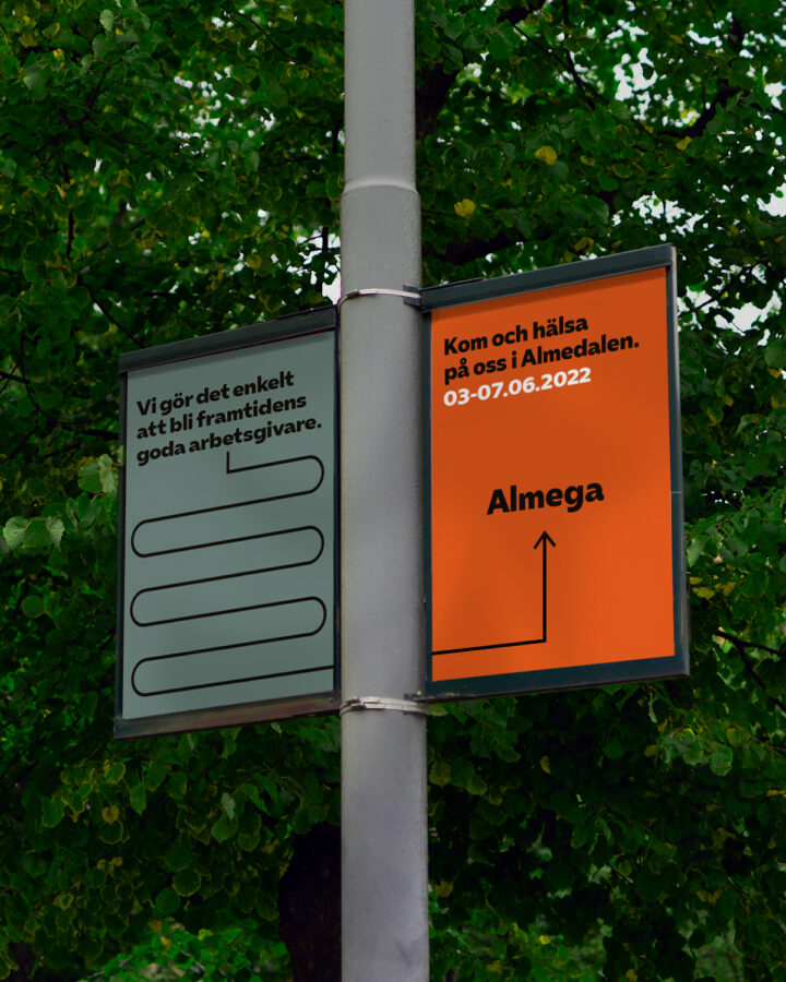
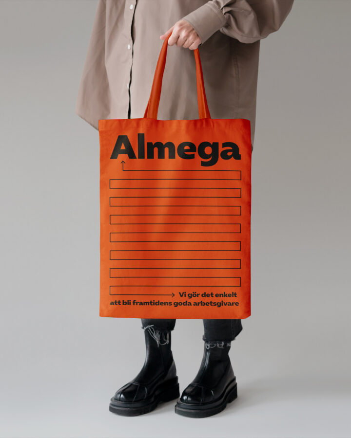
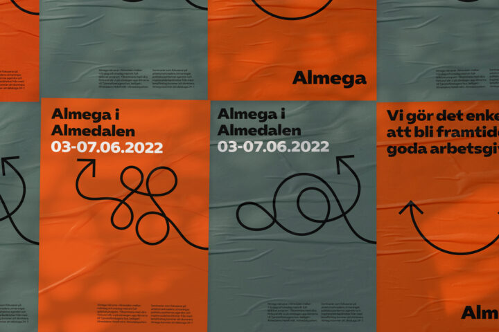
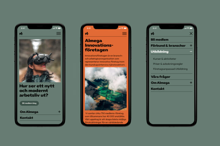
A custom typeface inspired by wayfinding together with a set of arrows and a script style A-symbol builds a solid yet flexible design system. The arrow becomes an icon that is both functional and playful. Our layout system consists of simple sub-divisions (halves, thirds and quarters) in order to make work easy for all teams creating engaging content in multiple channels.