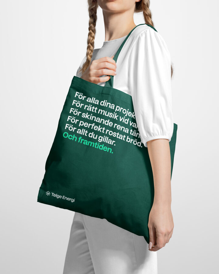
Telge Energi, an energy company working exclusively with providing energy from renewable sources. The new identity was developed in line with their new position, transitioning Telge Energi from being a small scale activist inspired brand to tech savvy green energy provider for all.
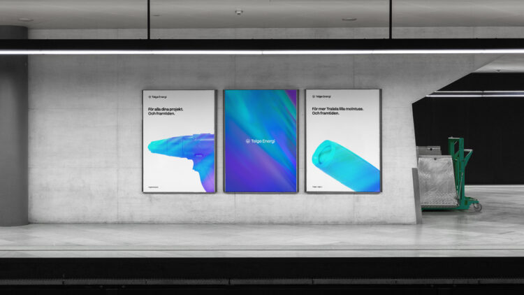
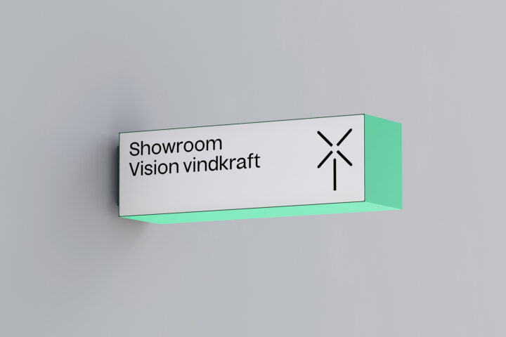
While functionality was a core predicament, brand impact was just as important through the process. The energy gradient pattern successfully makes this happen, as Telge Energi is identified in an instant.
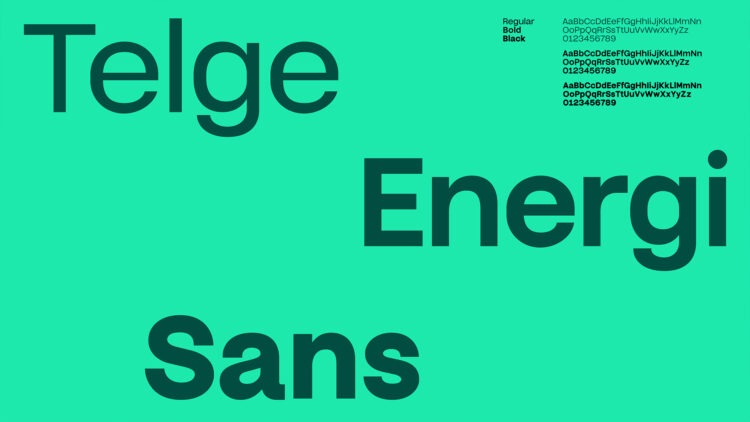
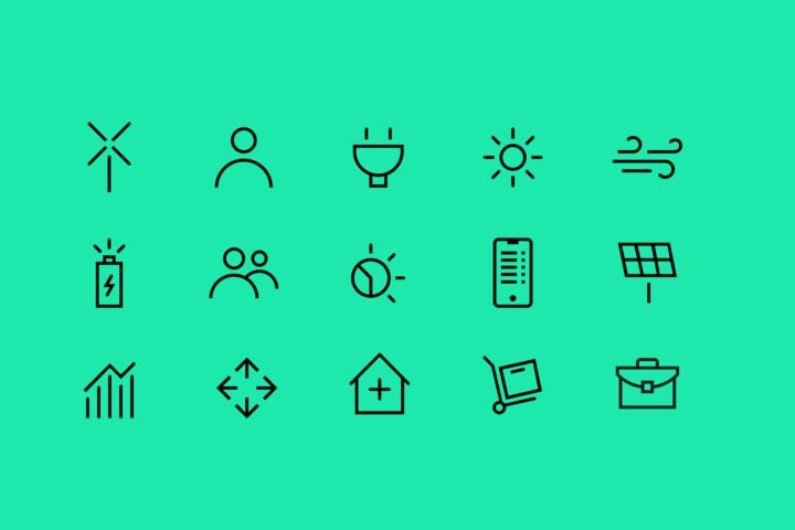
The custom typeface works in harmony with the rest of the identity and features a warm yet distinct form. Curves are quite organic while the basic anatomy is a bit boxier where the sides of round shapes are flattened. This serves as a solid foundation that provide stability for other more organic elements in the toolbox. The generous x-height together with a wider frame also makes it incredibly legible in small sizes. But where it really shines is digital use, regardless of platform.