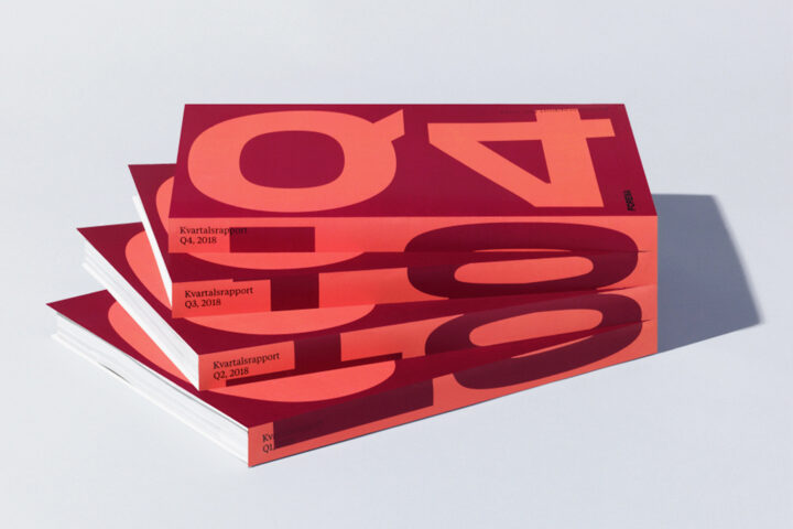
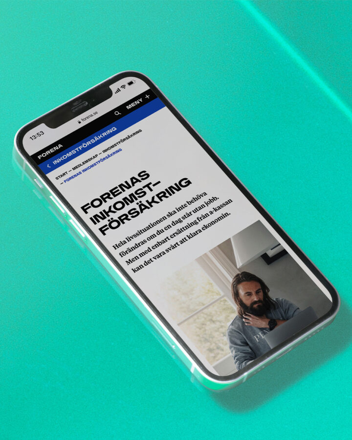
With over 14000 members, Forena is the largest union within the insurance industry. Forena were in need of a repositioning, aiming at a younger target audience. Our main objective was to create a cohesive brand experience, that is flexible and works for all touchpoints, from internal print products to digital channels.
To attract a younger target audience we decided to step away from the traditional visual expression of unions, insurance and banking.
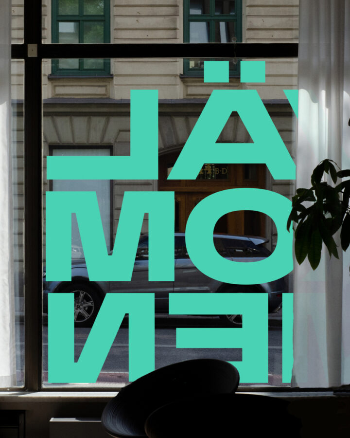
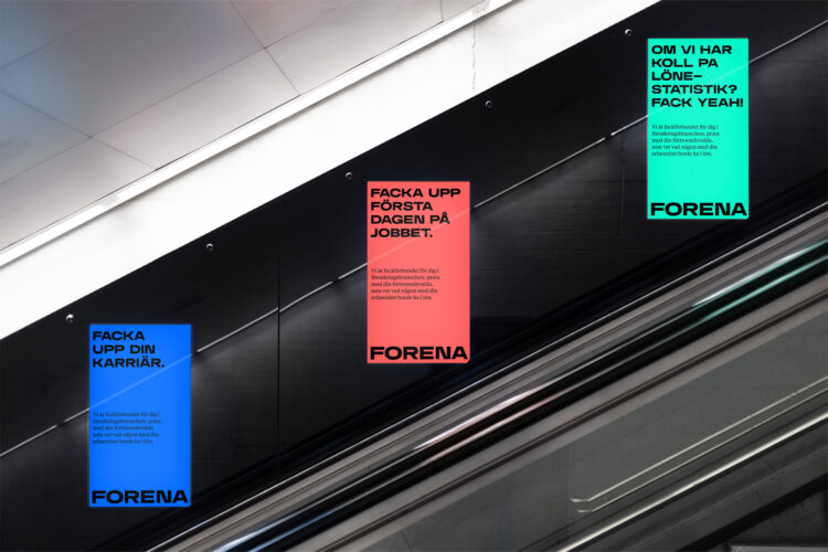
The concept “Förena” (connect) led the creative process and resulted in a distinctive variable display font that became the core of the identity. From the variable logotype to the type settings in all communications. Forena’s custom typeface is defined by elastic and bold shapes that adapt perfectly to its settings. A strong colour palette adds a vibrance enhances the new contemporary feel.