Gällivare
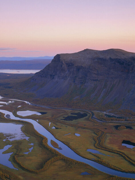
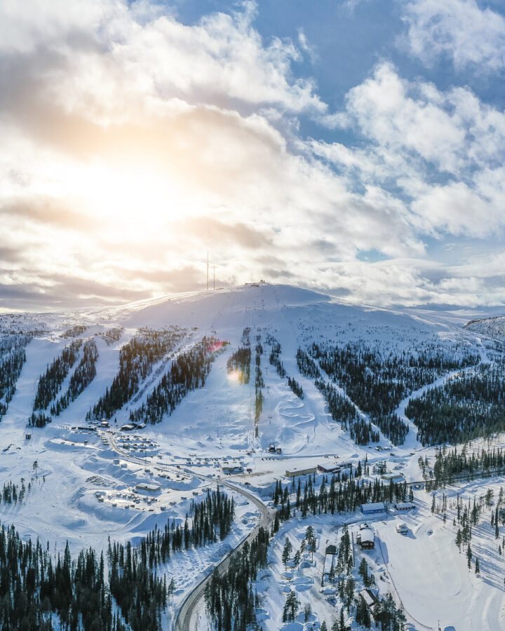
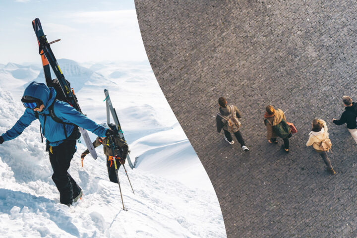
Gällivare is a small town with big ambitions and contrasting qualities, far up north in Sweden. It's primarily known for mining and to some extent skiing but there’s more than meets the eye; a bubbling entrepreneurial spirit, vast wilderness to explore and a massive shift towards green energy. A place of contrasts, of opposites, that attract.
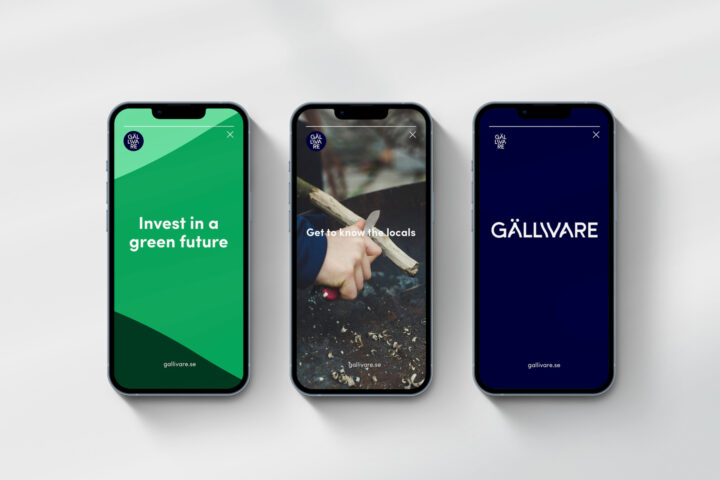
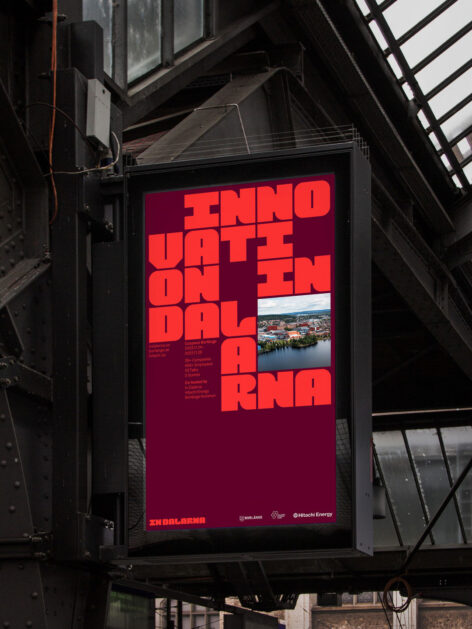
Gällivare's contrasts, from the great outdoors to its industrial heritage, are manifested in the visual expression for Gällivare. An expression where a multitude of things meet to create something new and exciting.
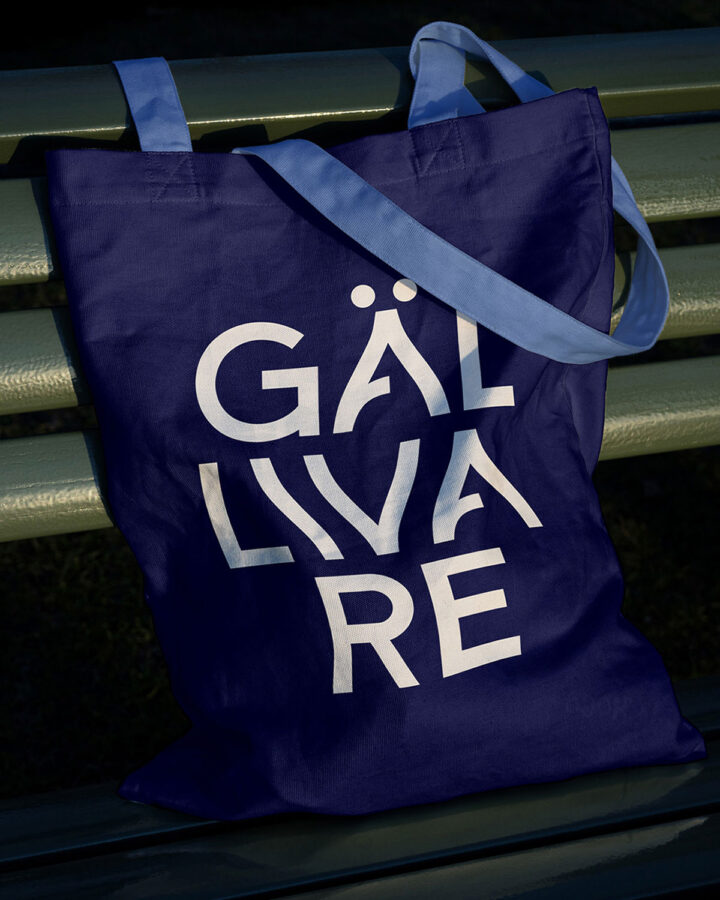
The old Sapmi name, Jiellevárri, translates to “The Cracked Mountain”. That notion of two contrasting sides together with the hiking routes in the mountains inspired the Gällivare logotype.
The identity strongly manifest a sense of place by borrowing from nature for an organic and natural look and feel that showcase Gällivare. A place for hiking, industry, skiing and adventures. A place to visit as much as a place to stay. Project made in collaboration with Placebrander.