In 2013 we designed the official brand Swedens visual identity. At the time one common visual identity for a nation was ground breaking, and our client The Council for the Promotion of Sweden was at the forefront of nation branding. In 2019-2020 the identity was updated to meet new needs and stay modern and innovative.
Design which reflects the heart and soul of a country is essential when branding an entire nation. We approached this challenge with simplicity and accuracy as keywords, using durability as a driving force. We asked ourselves, what symbol universally represents Sweden in order to raise awareness across countries and cultures.

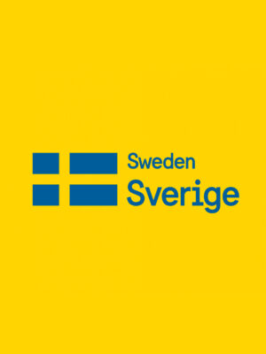
As flags are possibly the wides understood visual system representing nations, it became the focal point when creating the brand identity. Alongside that, we explored possibilities for a structured brand hierarchy and sender system. The combination of yellow and blue, sprung from the flag, are widely recognizable and works as primary colors.
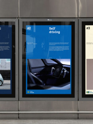
When updating the identity we added a spectra of secondary colors and different color combinations to give the identity a variety and a more up to date feeling working bettering in digital platforms. The custom typeface Sweden Sans in 4 weights was drawn in order to create a unified visual expression lasting over time and touchpoint.